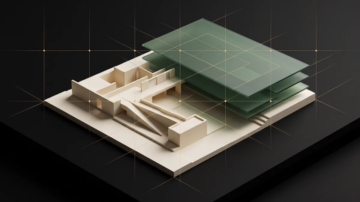
The strongest connection between 3D and UI is not visual spectacle. It is the discipline of directing attention: deciding what is foreground, what is context, and what can disappear without weakening the scene.
قویترین ارتباط میان سهبعدی و UI جلوه بصری نیست؛ انضباط هدایت توجه است: تصمیم درباره اینکه چه چیزی در پیشزمینه باشد، چه چیزی زمینه بسازد و چه چیزی بدون تضعیف صحنه حذف شود.
Composition is the architecture of attentionترکیببندی، معماری توجه است
In a render, every object competes for the frame. In an interface, every heading, card, badge, and button competes for attention. A clear focal point needs contrast and breathing room; supporting information needs rhythm; background detail needs restraint. If everything is emphasized, nothing is prioritized.
در یک رندر، هر شیء برای حضور در قاب رقابت میکند. در رابط، هر heading، card، badge و button برای توجه رقابت دارد. نقطه کانونی روشن به کنتراست و فضای تنفس نیاز دارد، اطلاعات پشتیبان به ریتم و جزئیات پسزمینه به خویشتنداری. اگر همهچیز تأکید شود، هیچچیز اولویت ندارد.
Start with large masses before details. Block the page in grayscale, test the reading path, and verify that hierarchy survives when images are unavailable. Color and texture should reinforce the composition, not rescue a structure that does not work.
پیش از جزئیات از جرمهای بزرگ شروع کنید. صفحه را خاکستری block کنید، مسیر خواندن را بیازمایید و مطمئن شوید hierarchy بدون تصویر هم زنده میماند. رنگ و texture باید ترکیب را تقویت کنند، نه ساختاری را نجات دهند که کار نمیکند.
Light becomes contrast and stateنور در رابط به کنتراست و وضعیت تبدیل میشود
Light reveals form in 3D. In UI, contrast reveals structure: active versus inactive, foreground versus background, interactive versus decorative. A bright accent is most useful when scarce. Repeating it everywhere converts a signal into noise.
نور در سهبعدی فرم را آشکار میکند. در UI، کنتراست ساختار را آشکار میکند: فعال در برابر غیرفعال، پیشزمینه در برابر پسزمینه و تعاملی در برابر تزئینی. accent روشن وقتی کمیاب است بیشترین کارایی را دارد؛ تکرار آن در همهجا سیگنال را به نویز تبدیل میکند.
Check contrast in context, not as isolated color swatches. Thin type, image overlays, disabled controls, focus rings, and text viewed outdoors all behave differently. Accessibility ratios are a baseline; perceptual clarity also depends on size, weight, spacing, glare, and the user’s environment.
کنتراست را در context بسنجید، نه در swatch جدا. فونت نازک، overlay روی تصویر، کنترل غیرفعال، focus ring و متنی که زیر نور محیط دیده میشود رفتار متفاوت دارند. نسبتهای دسترسپذیری خط مبنا هستند؛ وضوح ادراکی به اندازه، وزن، فاصله، glare و محیط کاربر هم وابسته است.
Material is a promise about behaviorمتریال، وعدهای درباره رفتار است
A convincing material has consistent rules for reflection, roughness, edge, and scale. Interface surfaces need the same consistency. A card that looks elevated should behave like a distinct layer. A control that looks pressed should communicate state. Borders, shadows, blur, and radius are not decoration when they explain grouping and depth.
متریال باورپذیر قواعد ثابتی برای بازتاب، roughness، لبه و مقیاس دارد. سطحهای رابط هم به همین انسجام نیاز دارند. کارتی که elevated دیده میشود باید مثل لایهای مستقل رفتار کند. کنترلی که فشرده به نظر میرسد باید state را منتقل کند. border، shadow، blur و radius وقتی گروهبندی و عمق را توضیح میدهند تزئین صرف نیستند.
Build a small surface vocabulary and use it deliberately: base canvas, quiet panel, active panel, floating overlay, and critical layer. Too many near-identical surfaces increase CSS complexity while making the product harder to understand.
واژگان کوچکی برای سطحها بسازید و هدفمند استفاده کنید: بوم پایه، panel آرام، panel فعال، overlay شناور و لایه بحرانی. سطحهای متعدد و تقریباً مشابه، پیچیدگی CSS را بالا میبرند و درک محصول را سختتر میکنند.
The camera becomes viewport and reading pathدوربین به viewport و مسیر خواندن تبدیل میشود
A camera defines what the viewer can see and what remains outside the frame. Responsive design does the same across thousands of viewport combinations. Cropping a portrait, hiding metadata, or moving a call to action changes the story—not just the layout.
دوربین تعیین میکند بیننده چه چیزی را ببیند و چه چیزی بیرون قاب بماند. طراحی واکنشگرا همین کار را در هزاران ترکیب viewport انجام میدهد. crop کردن پرتره، پنهانکردن metadata یا جابهجایی CTA داستان را تغییر میدهد، نه فقط layout را.
Use focal points for imagery, logical properties for direction, and content-aware breakpoints for composition. Test the exact assets and languages that will ship. A portrait must keep the face and hairline; Persian type needs enough width for its natural rhythm; controls must remain reachable without covering content.
برای تصویر focal point، برای جهت logical property و برای composition breakpoint محتوامحور استفاده کنید. همان asset و زبانی را تست کنید که منتشر میشود. پرتره باید چهره و خط مو را حفظ کند، تایپ فارسی عرض کافی برای ریتم طبیعی خود داشته باشد و کنترلها بدون پوشاندن محتوا در دسترس بمانند.
Motion should explain changeحرکت باید تغییر را توضیح دهد
Animation is useful when it preserves continuity: an element enters from its source, a panel reveals hierarchy, progress reflects real state, or a transition helps the user understand where they arrived. Motion that repeats without information quickly becomes friction.
انیمیشن زمانی مفید است که پیوستگی را حفظ کند: عنصر از مبدأ خود وارد شود، panel hierarchy را آشکار کند، progress وضعیت واقعی را نشان دهد یا transition به کاربر بفهماند کجا رسیده است. حرکت تکراری بدون اطلاعات بهسرعت به اصطکاک تبدیل میشود.
Choose one motion language, keep durations proportional to distance, and allow interruption. Respect reduced-motion preferences and make the final state complete without animation. Performance is part of the aesthetic: a smooth, stable interface feels more premium than an elaborate effect that drops frames or shifts layout.
یک زبان حرکتی انتخاب کنید، duration را با فاصله متناسب نگه دارید و امکان interruption بدهید. reduced-motion را رعایت کنید و حالت نهایی را بدون انیمیشن کامل بسازید. performance بخشی از زیباییشناسی است: رابط روان و پایدار از افکت پیچیدهای که frame از دست میدهد یا layout را جابهجا میکند premiumتر است.
- One focal point per meaningful viewportیک نقطه کانونی برای هر viewport معنادار
- Surface styling communicates grouping and stateاستایل سطح، گروهبندی و state را توضیح میدهد
- Real assets preserve their focal contentasset واقعی محتوای کانونی خود را حفظ میکند
- Motion works with reduced motion and low powerحرکت با reduced motion و توان پایین هم درست کار میکند